sparkcon animated mural
Client
SPARKcon Art Festival
Year
2019+
CREATIVE BRIEF / Create an animated infographic mural to visually inform SPARKcon festival attendees a brief history of the Warehouse District in Raleigh, NC while paying homage to Raleigh influencers of the area.
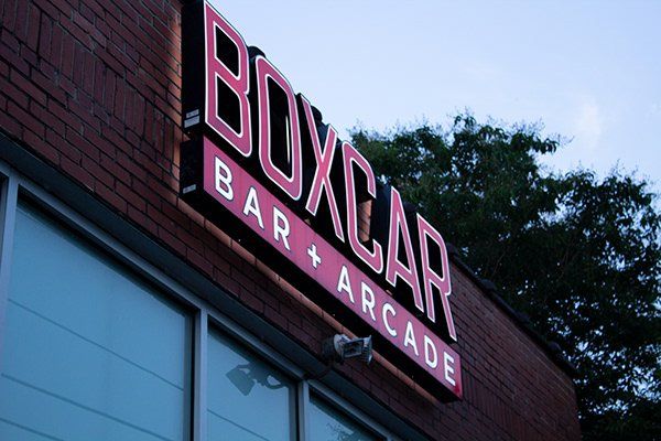
INTRO / SPARKcon is a unique four-day creativity festival in Downtown Raleigh, North Carolina. The mural was displayed downtown Raleigh during the festival by being projected onto the walls of downtown & CAM, Raleigh's contemporary art museum downtown in the Warehouse District for the 2019 and future festivals.
role(s)
Visual Designer
Motion Graphics Designer
Art Director
Illustrator
Copywriter
After the logo was selected by the client we moved onto creating brand guidelines uniforms, mascots, stationary and developed a social media visual guide and strategy.
let's go for a walk
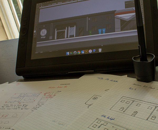
The next challenge was art direction, I want the animation to fit right in the district. At 1st I wanted to stick with the same illustration style throughout the mural but then it hit me, this is Raleigh’s Warehouse District and it represents so many creative perspectives that I had to show that. It’s more than just monochromatic murals on walls; it’s an area of collaboration. So I did my best to create different styles that works together transitioning throughout the animation and keeping key traits in mind such as tons of red with distressed fonts but keeping in mind this maybe projected on a red brick wall rather than white so limiting my use of reds.
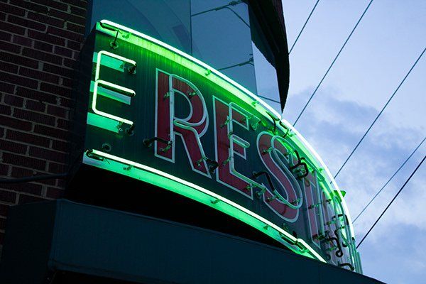
To help I took a small tour downtown the district with my camera and took photos of the area to examine and find unique characteristics of the warehouse district to aid in my art direction. The majority of visuals I noticed were lots of red brick, distressed texts, painted murals, logos on shops made out of sheet metal, bold fonts, and neon signs.


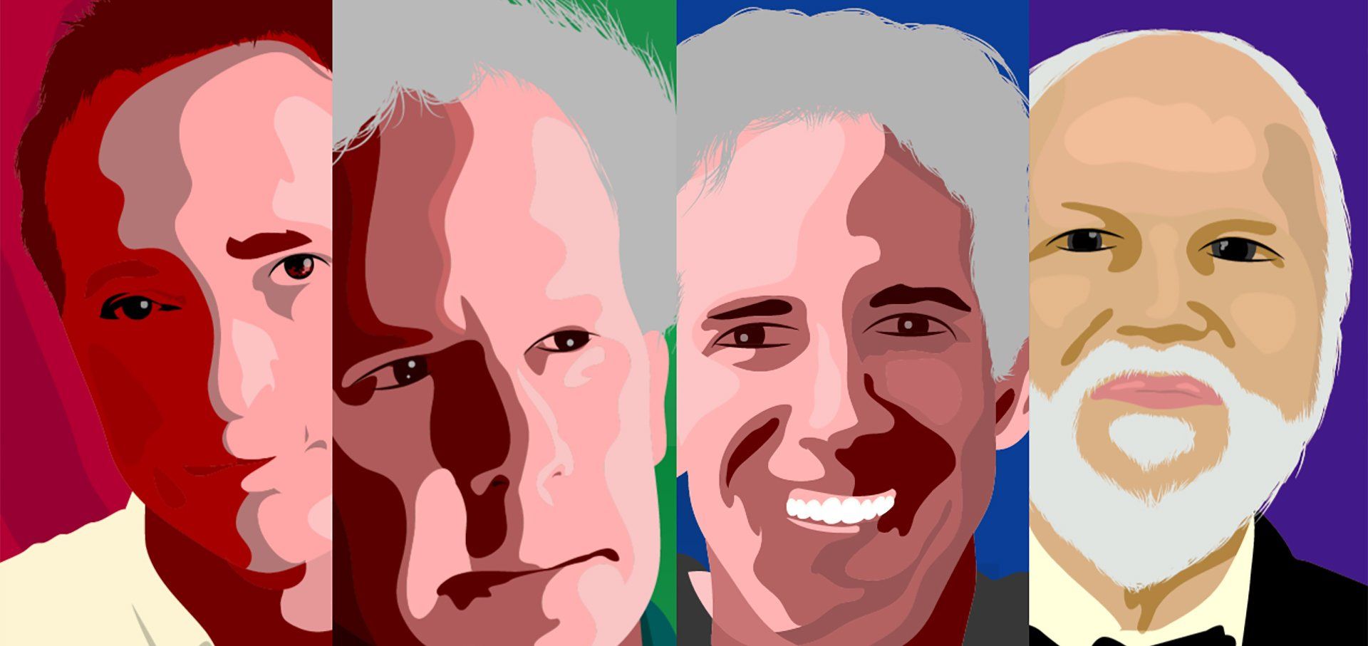
Considering these visuals in the environment I developed a visual system involving a 1950s, 1980s, and modern color palette since the murals were tied to the past and present topics I felt it was important to show the time transitions within the animation using colors and design styles. I kept the 1950s illustrations simple, used an illustration brush to show aged materials you may find in an old industrial warehouse, the 1980s mural scenes were inspired by both pop art and the styles of the murals I have taken photos downtown. The last scene were a modern day illustration of downtown Raleigh district featuring objects I see on a daily basis. The header font family is a mix between the bold fonts & distressed texts around the district while using the SPARKcon’s logotype as a basis.
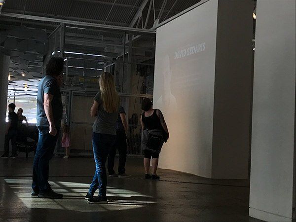
Many of attendees enjoyed the murals especially the Raleigh Beer Trolley animation along with the downtown influencers. The animation played all day and night Saturday & Sunday in the CAM Museum downtown Raleigh.


Related Projects
-
![]()
logofolio
see more -
![]()
-
![]()

i'm ready when you are...
theCreativeSNARK@gmail.com
based in...
USA
Copyright © 2024 CreativeSNARK. All rights reserved.