
advance auto mobile app
Employer
Advance Auto Parts
Year
2020
CREATIVE BRIEF / Create an overall look and art direction for Advance Auto Parts mobile app launch and ongoing marketing materials to promote the app and its features.
INTRO / I collaborated with a team consisting of copywriters, creative manager, senior graphic designer, and marketing partners. During the process, I solely worked on creating and coming up with my own concepts and art direction to present to the creative manager for prior approval before gaining approval for the overall marketing team.
After a concept was chosen to be the art direction for the launch, other team members were to create marketing elements for store signage, social media, print, motion graphics, and email.
role(s)
Graphic Designer
Art Director
Photographer
"behind the lens"
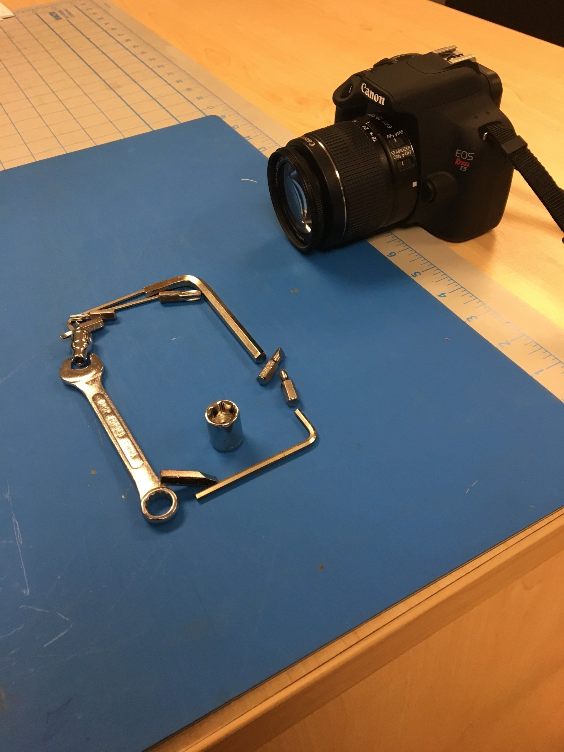
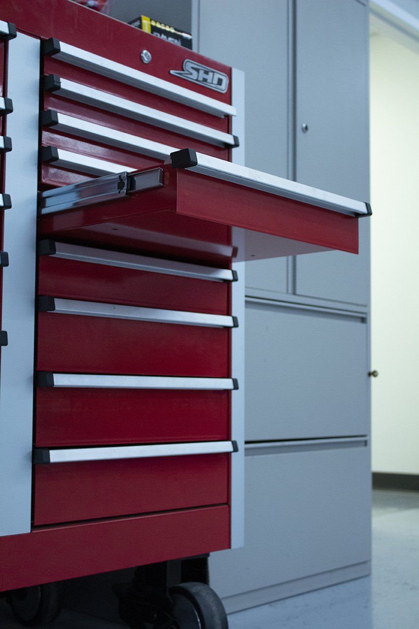
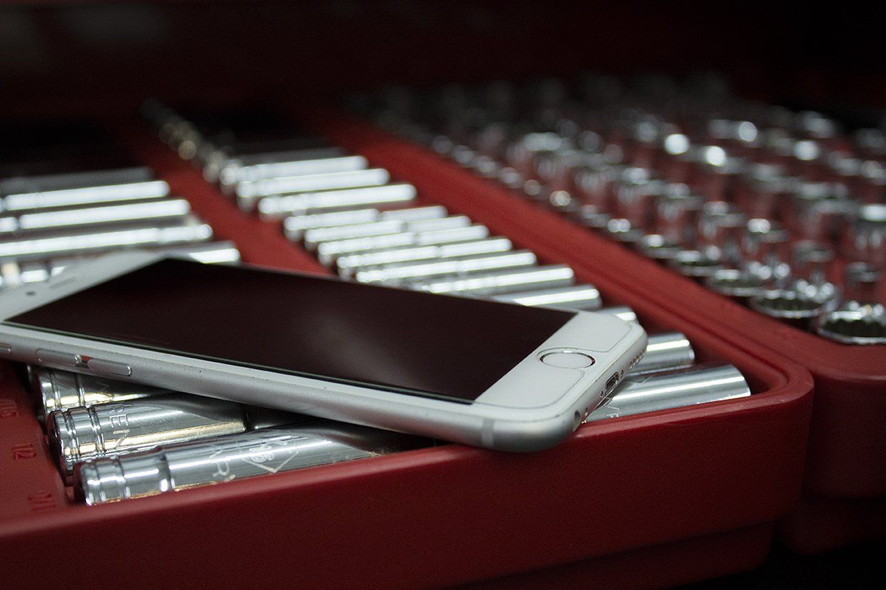
To support the final creative I began shooting my own photography rather than rely on stock image sites as I wanted absolute creative control of the art direction. Spent an afternoon shooting in Carquest's Training garage to capture lifestyle photos for future materials along with shooting a tool chest for the main ad visual along with shooting an arrangement of tools to represent a phone for the deconstructed phone ad.
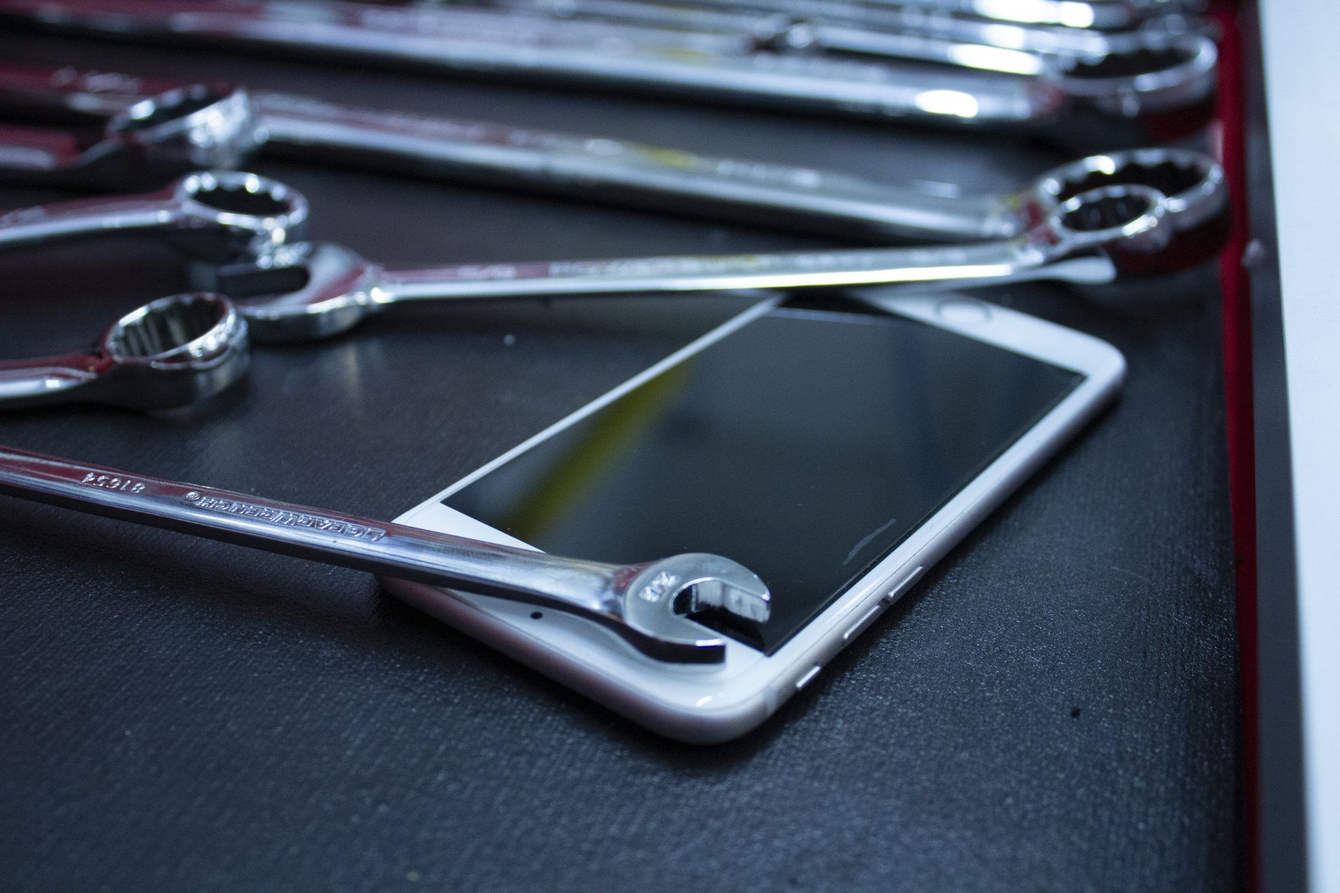
Afterwards, I began editing photos in Adobe Photoshop adjusting color and keeping in mind that Advance's branding utilizes warm & highly contrast visuals.
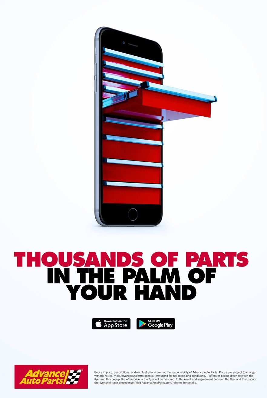
all your tools
in your hand
The direction for this concept came from my belief the app is a digital toolbox. As a fellow car guy, I imagined myself needing a tool in the middle of a project where I could just grab my phone and place an order utilizing the Same Day Delivery feature. Metaphorically speaking the end user could stick their hand in the phone's toolbox and grab whatever tool they need, hence "The thousands of parts in the palm of your hand." The app is a secondary toolbox in your garage.
After this was approved as the main visual for the campaign launch, multiple elements were created by the creative team such as email, print and, social media. The final layout was created by the Senior Designer using the tool box phone as the main focal point.
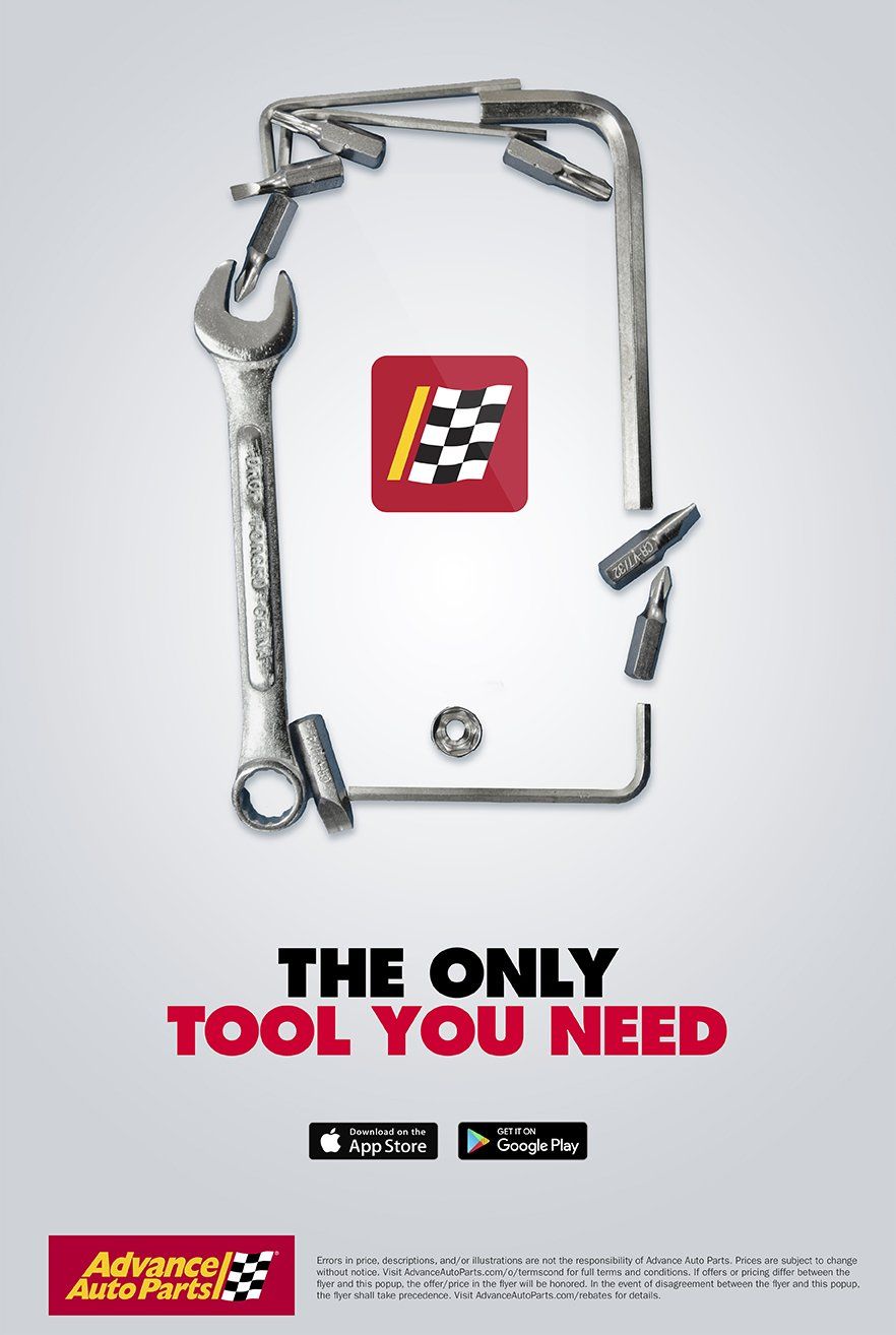
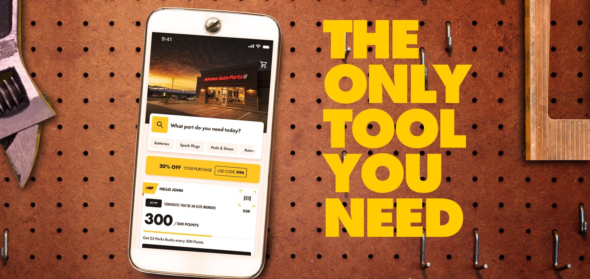
the only tool
you need
Going into a more abstract direction, I wanted to create a subliminal visual. Keeping in mind the phone app is a tool to aid the end user with their DIY project, I decided to create the representation of a phone using tools with the app icon displayed on the metaphorical screen connecting to the headline "The Only Tool You Need."
creative supported by market research
Prior to launch the creative team collaborated with the market research team using surveys and focus group to get feedback from individuals representing all of Advance Auto's customers profiles. Here is some of the feedback received regarding the toolbox phone visual.. Here
A+++
"It makes the phone look like one of your tools."
Catches the eye
"The toolbox in phone looks neat and most people that shop enough at auto parts store are DIY, and usually something new or unique that has to do with toolboxes or storage catch their eye.". "
No bad screen glare
"It's the only one that has the slightest indication of who or what the app is for (toolbox motif, Advance logo) they all need to say Advance Auto somewhere. This is also the only ad that doesn't have a photo of a phone with bad screen glare."
Relates to the customer
"It is about tools, which relates to working on a car. A phone does not relate to working on a car."
let's get moving
I also created motion graphics for paid YouTube and social media ads to communicate app features & introduce the new "Same Day" service post launch.
20% Growth YOY
Consumers Spent $143 Billion
218 Billion
Downloads in a year from launch
3.5 Trillion
Hours spent on the app
Related Projects
-
![]()
advance your holiday campaign
see more -
![]()
-
![]()

i'm ready when you are...
theCreativeSNARK@gmail.com
based in...
USA
Copyright © 2024 CreativeSNARK. All rights reserved.