
liberty steam branding
Client
Liberty STEAM Charter School
Year
2021+

CREATIVE BRIEF / The goal of the project was to create a new visual brand that would convey a sense of innovation & traditional. The main challenge was differentiating the brand among surrounding schools in the area.
Along with a branding strategy, the project included designing school uniforms, IDs, mascot, stationary, brand guides, web element, social media visuals, and a social media strategy.
INTRO / Liberty STEAM Charter is a charter school in Sumter, SC offering a kindergarten through 12th-grade STEAM-focused, project-based, and personalized learning model that is innovative and unlike any other school in South Carolina.
role(s)
Brand Designer
Brand Strategist
Art Director
Illustrator
let's start from the beginning


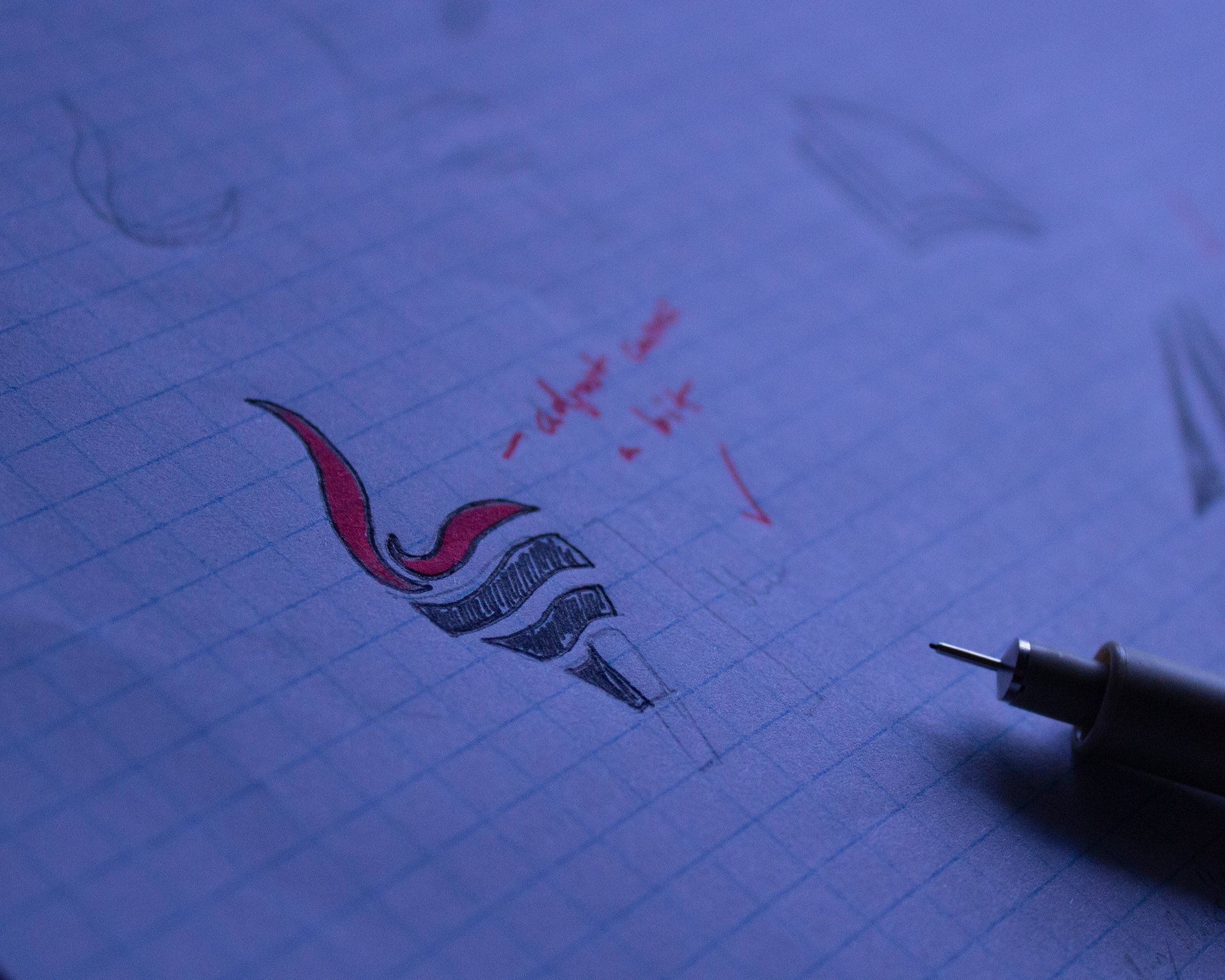
logo concept 1
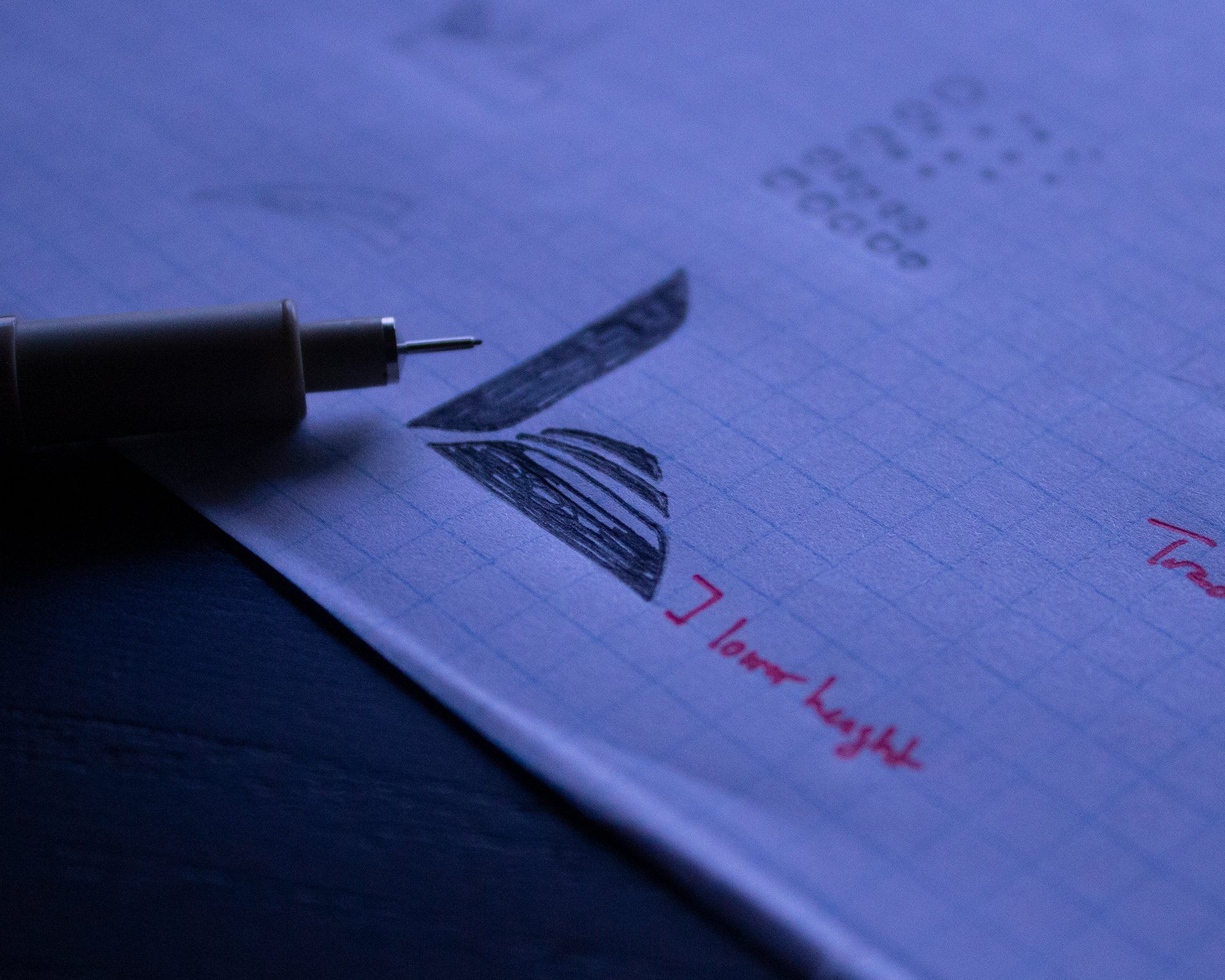
logo concept 2
"One thing I had to keep in mind is during the identity development was making sure the logo translates perfectly for embroidery.
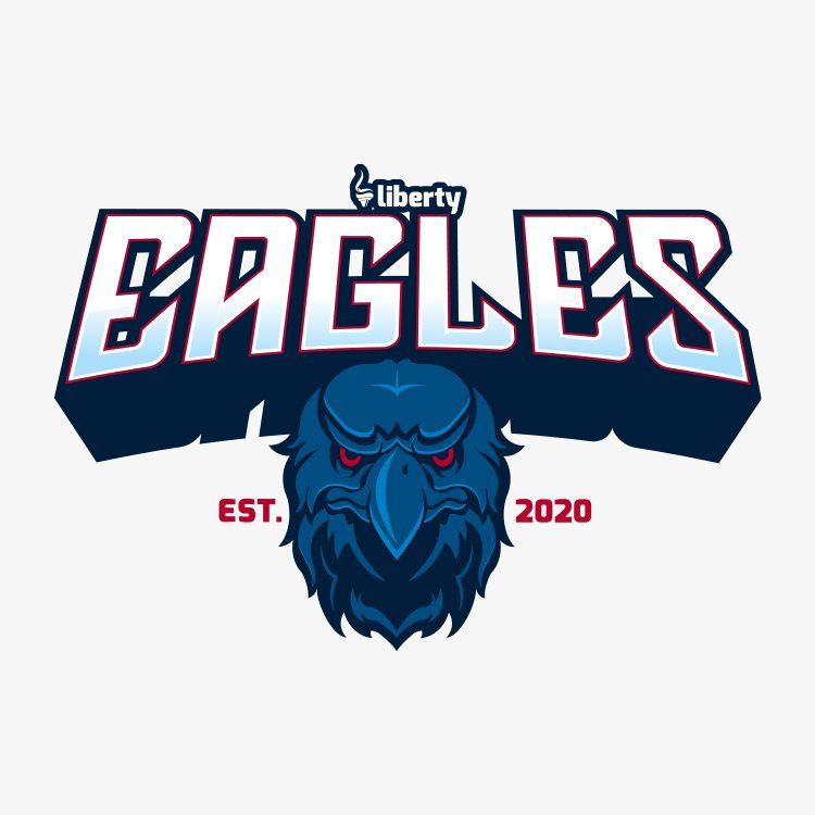
The main font chosen was Exo which was chosen for all logo concepts as it has a futuristic feel. Paired with the traditional book & torch icons it's a way to say “we are traditional and have our roots but we are innovative and timeless.”
Considering how Liberty’s goal was to be a brand that would convey a sense of innovation and traditional values...
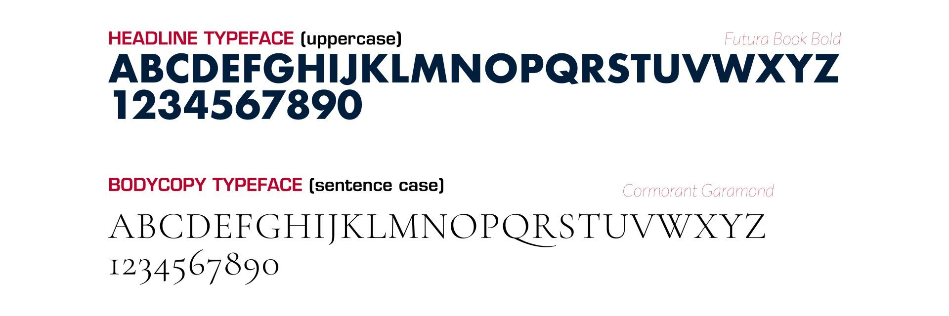
Futura was chosen for the header as it is bold, serious, modern and forward. Its Bauhaus history pairs well the geometric iconography chosen for the school’s visual branding. Garamond’s traditional feel balance’s Future’s modernism with its serifs and maintains readability at small points.
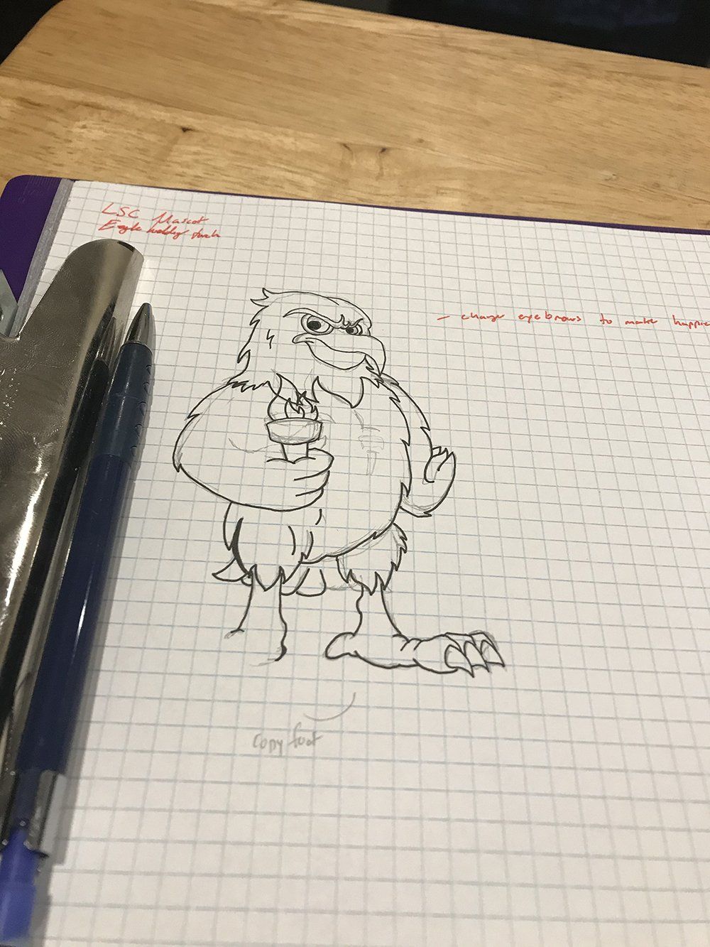
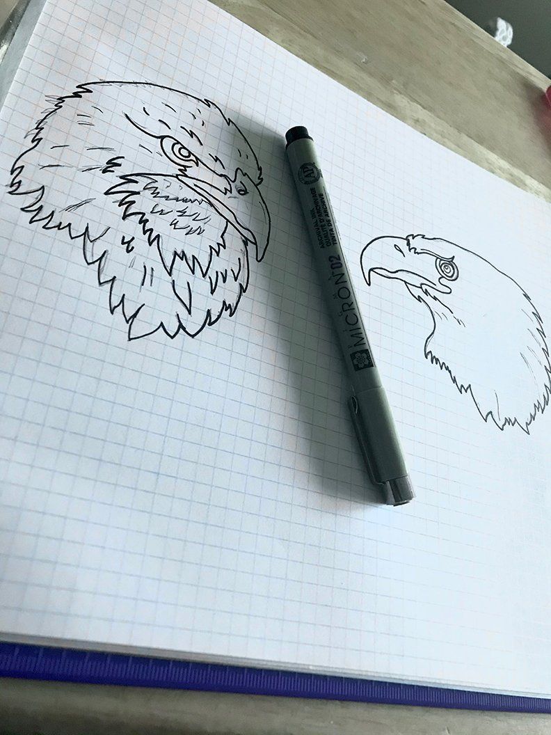
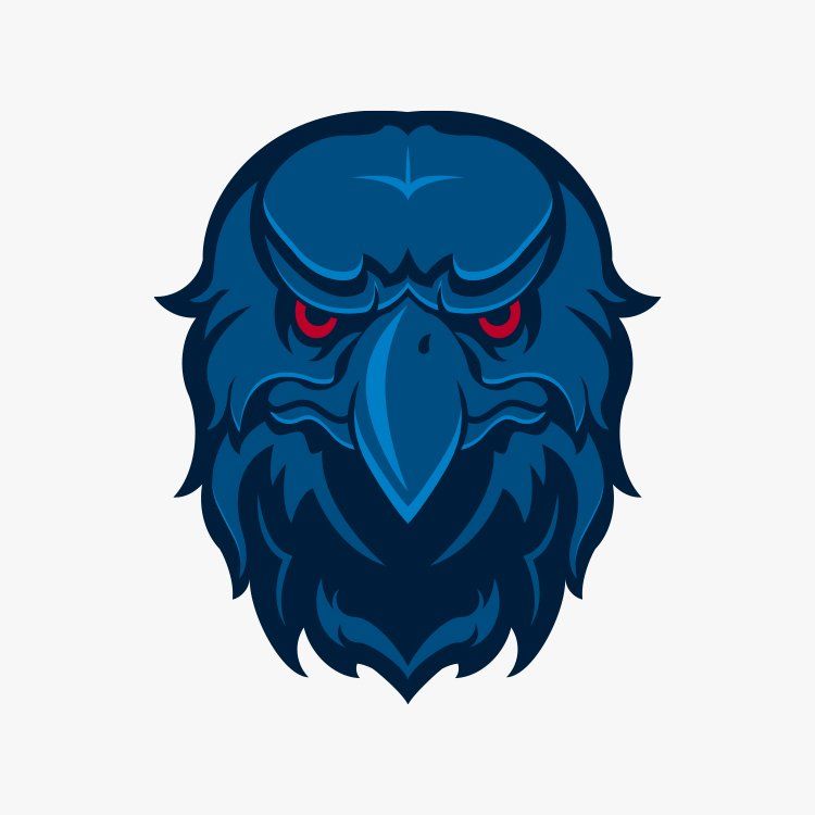
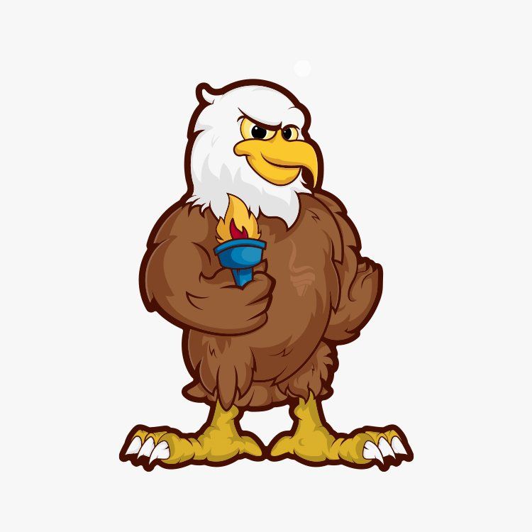
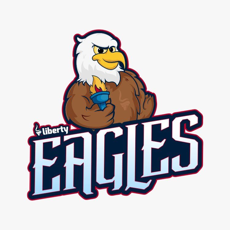
mascot time!
After creating the logo, handbook, mock ups, social media templates, and other brand materials, the next step was to create a mascot illustration for the school.
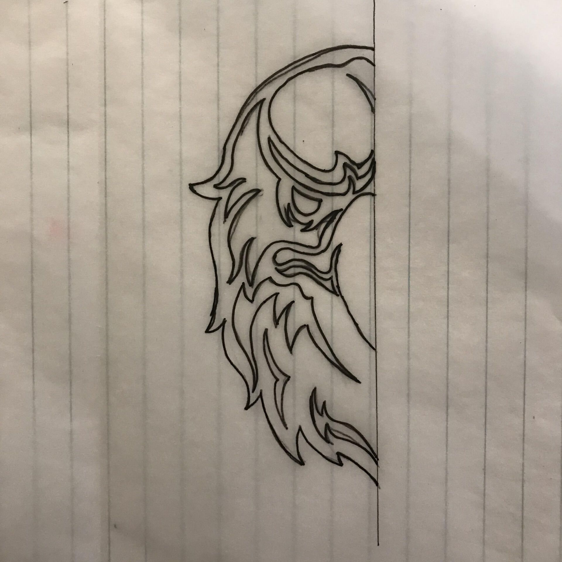
I started this process by exploring various art directions & styles by sketching out rough drawings and refining the sketches until satisfied before moving onto the computer. I created over 10 different mascots and the two below stuck out to me the most.
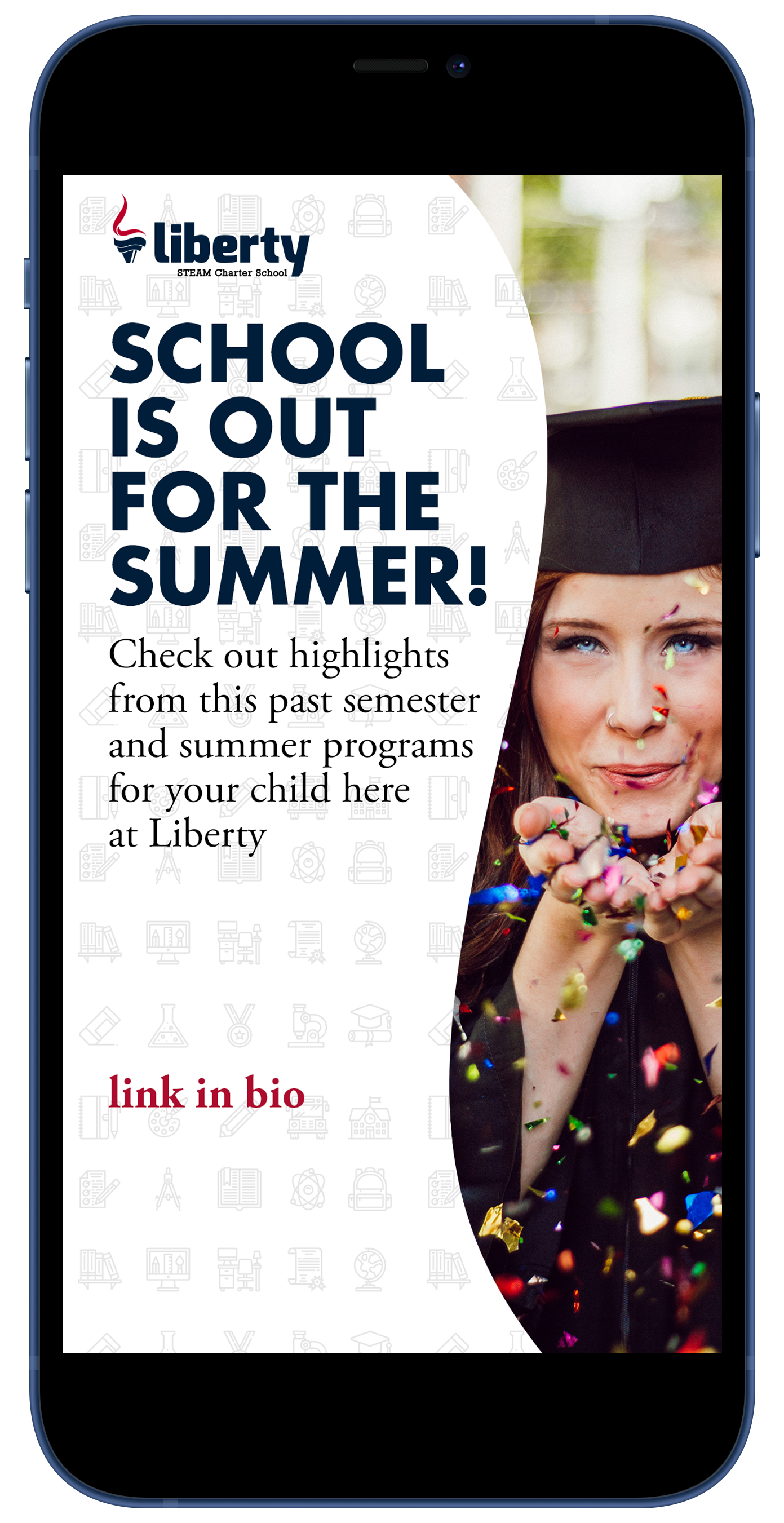
Social Media Templates
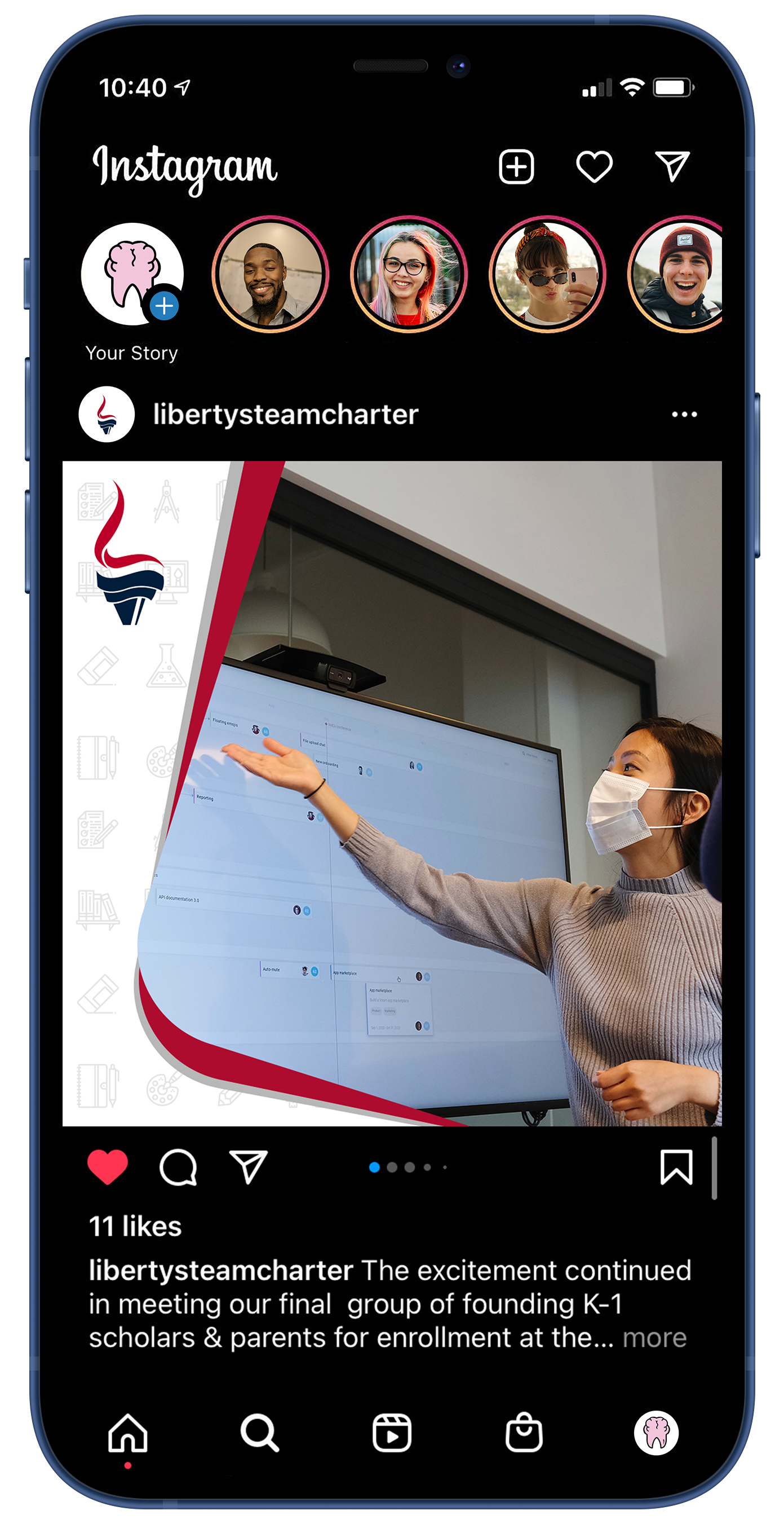
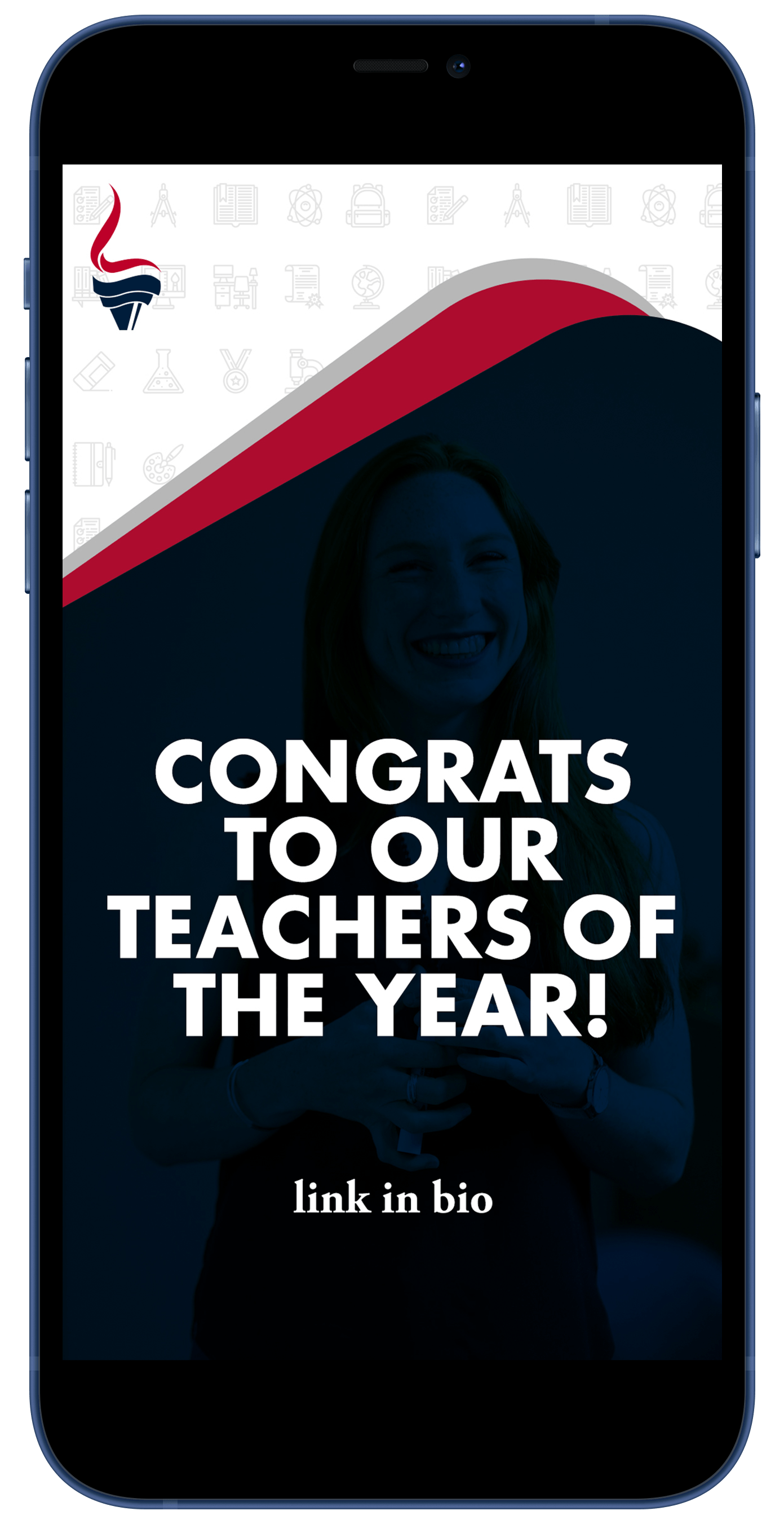
Stories
Teacher of the Year!
Related Projects
-
![]()
advance your holiday
see more -
![]()
-
![]()
i'm ready when you are...
theCreativeSNARK@gmail.com
based in...
USA
Copyright © 2024 CreativeSNARK. All rights reserved.